Old Website
Old Home page
One of the bad things with the old home page was that it felt really disconnected, the banner was just a dark blue with some icons and on the home page itself it had an “Our story” part which should have been on the About page.
Old Security Page
Every product page was just a white screen with some text and maybe bold titles in boxes. It didn’t say much about the product itself and did not look appealing.
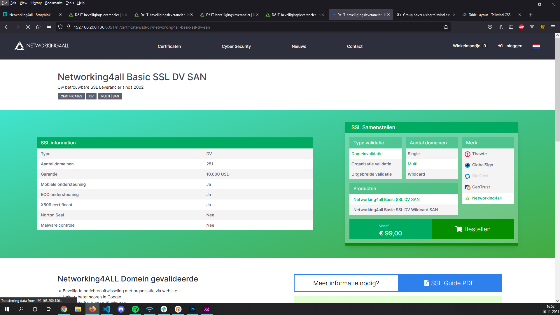
Old Certificate Page
Here you could make a selection from a few big buttons and then a list would be generated. There was no direct info on the products or services whatsoever.
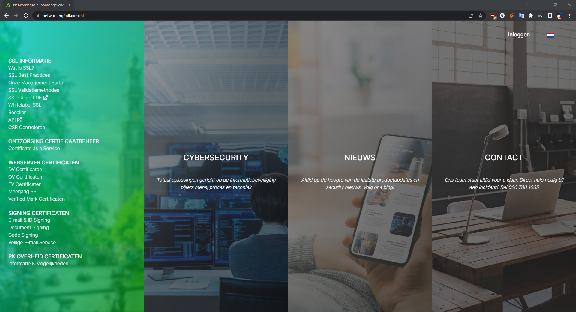
New Website
New Home page
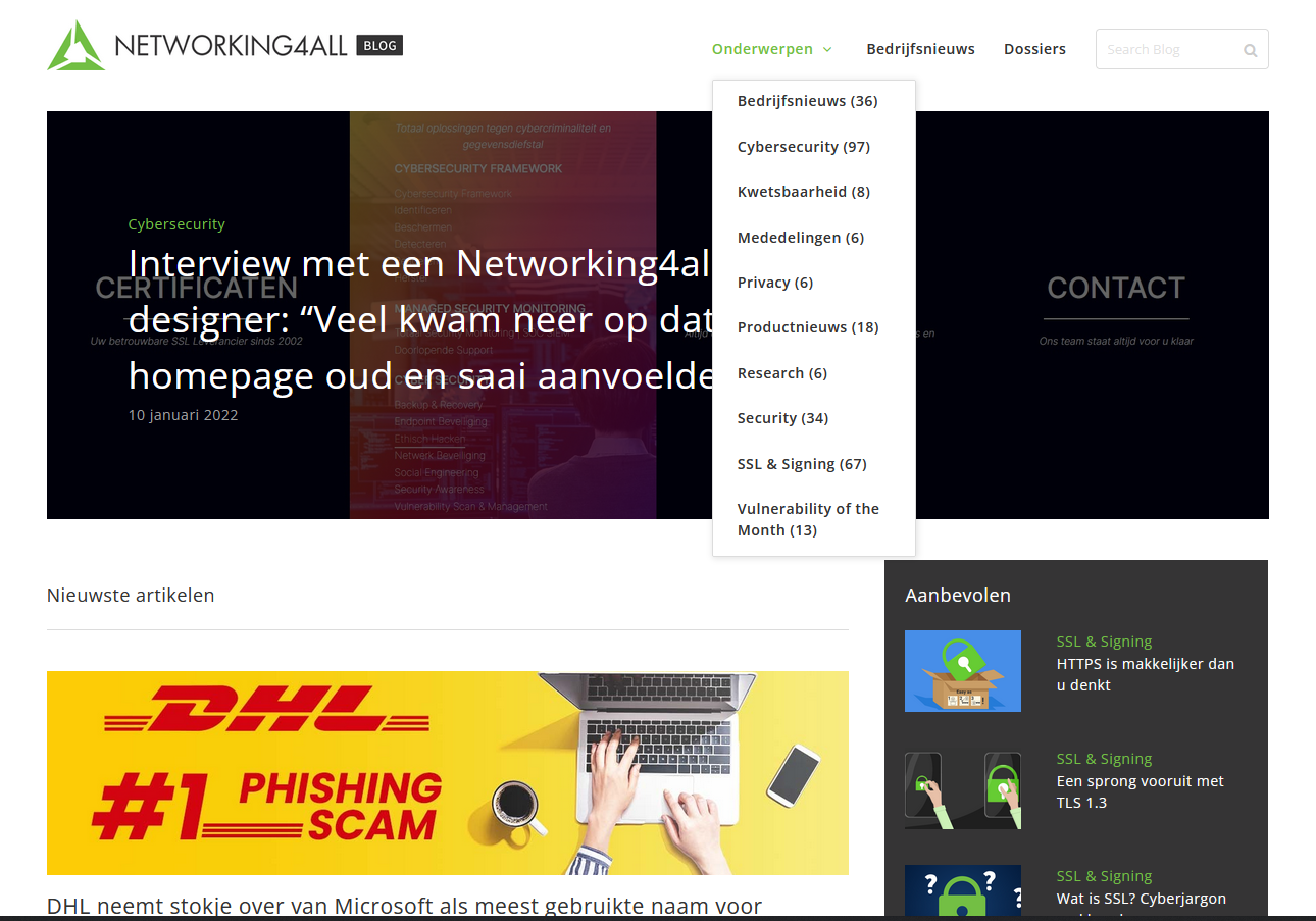
On the new homepage you can hover over the menus. They have soft color gradients and the products use the same color palette. From here you can go to sub-category pages like “Ethical Hacking” or “Vulnerability Scan”.
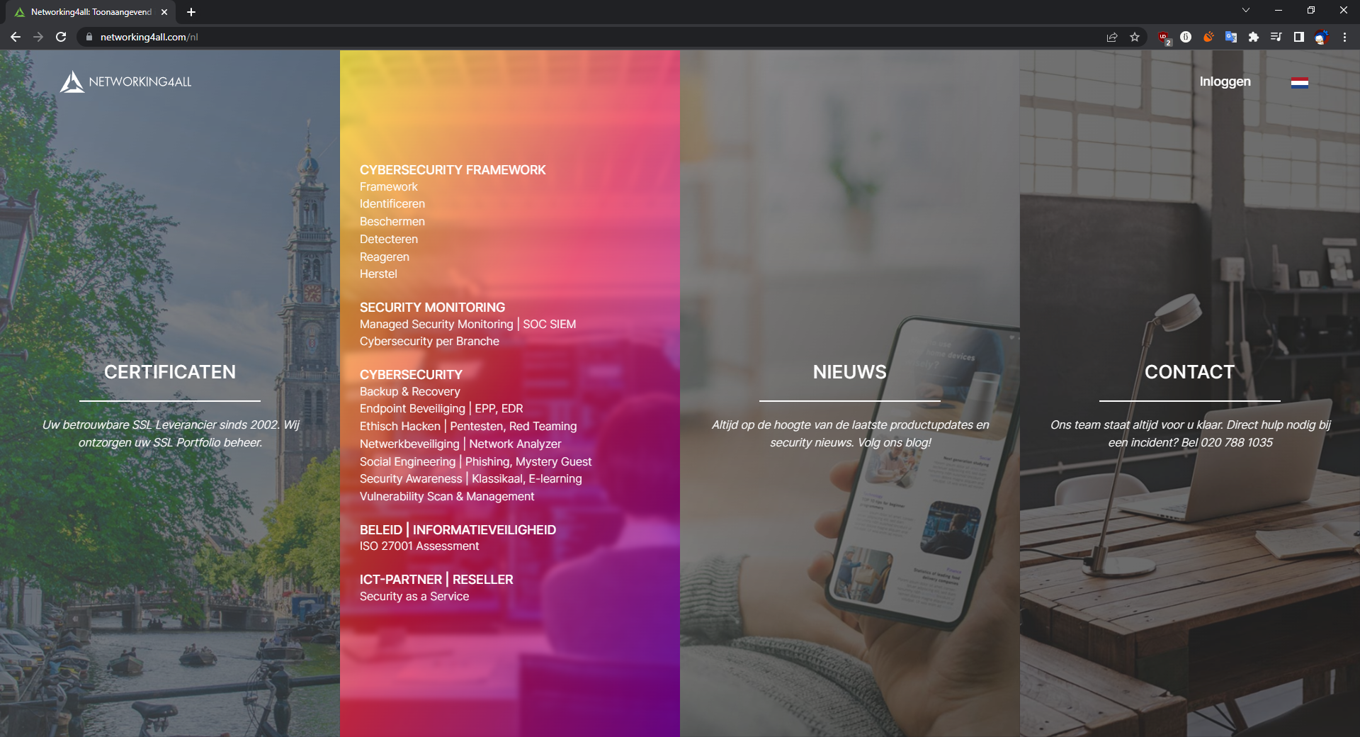
New sub-category pages
These didn't exist with the old site and it was getting harder to navigate because the list of services and products just kept growing. So we made these sub pages to divide and direct people to what they want to see.
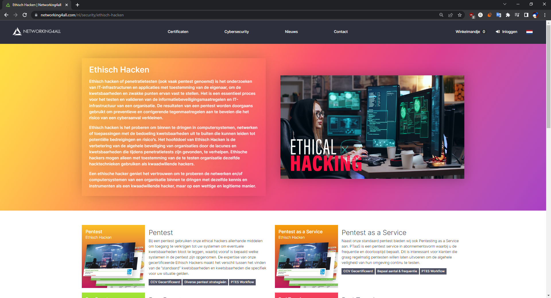
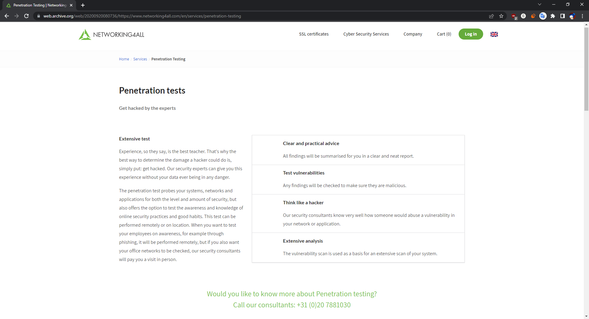
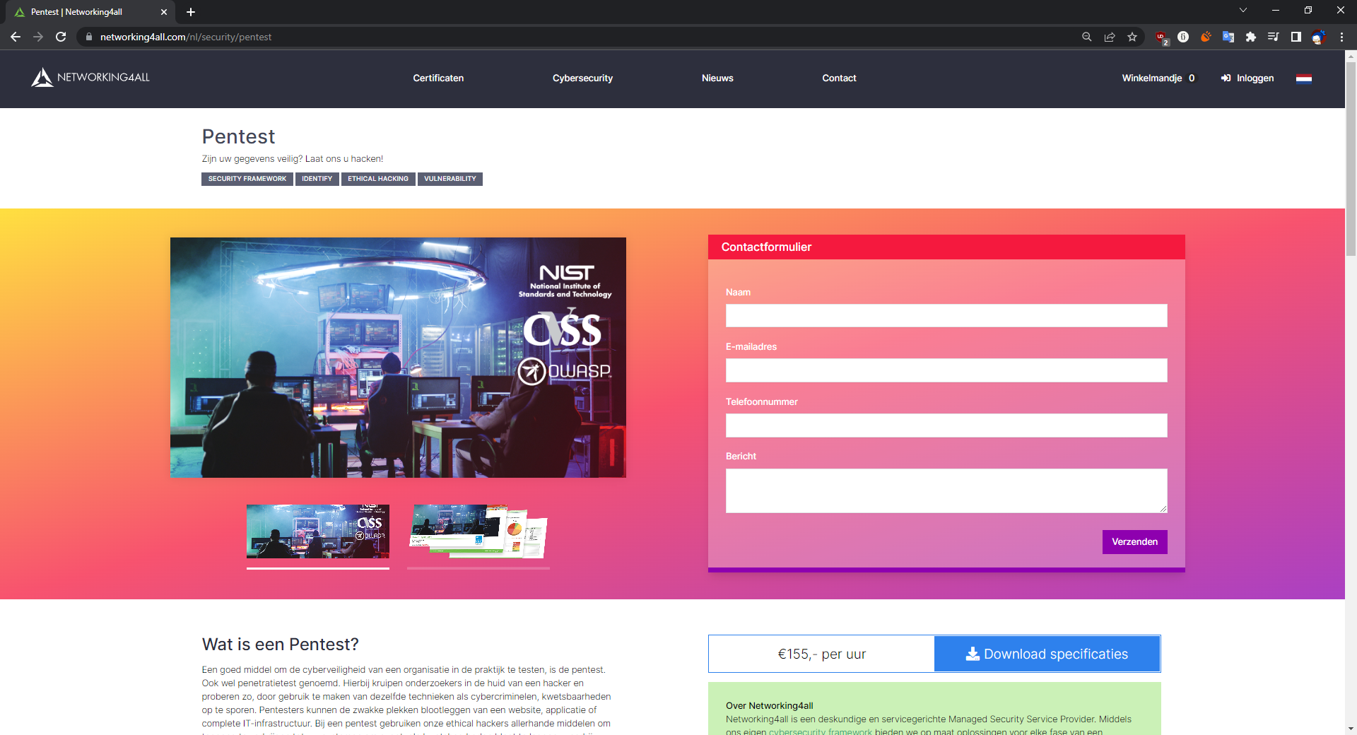
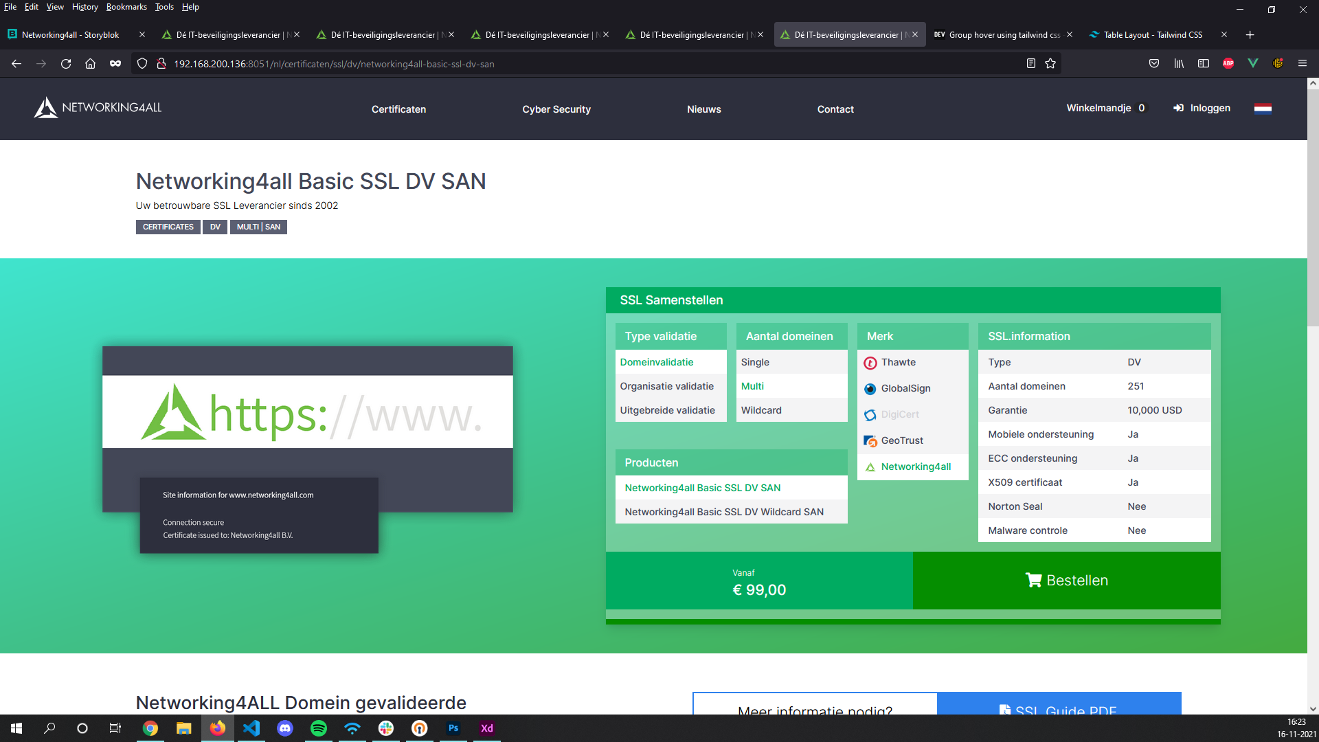
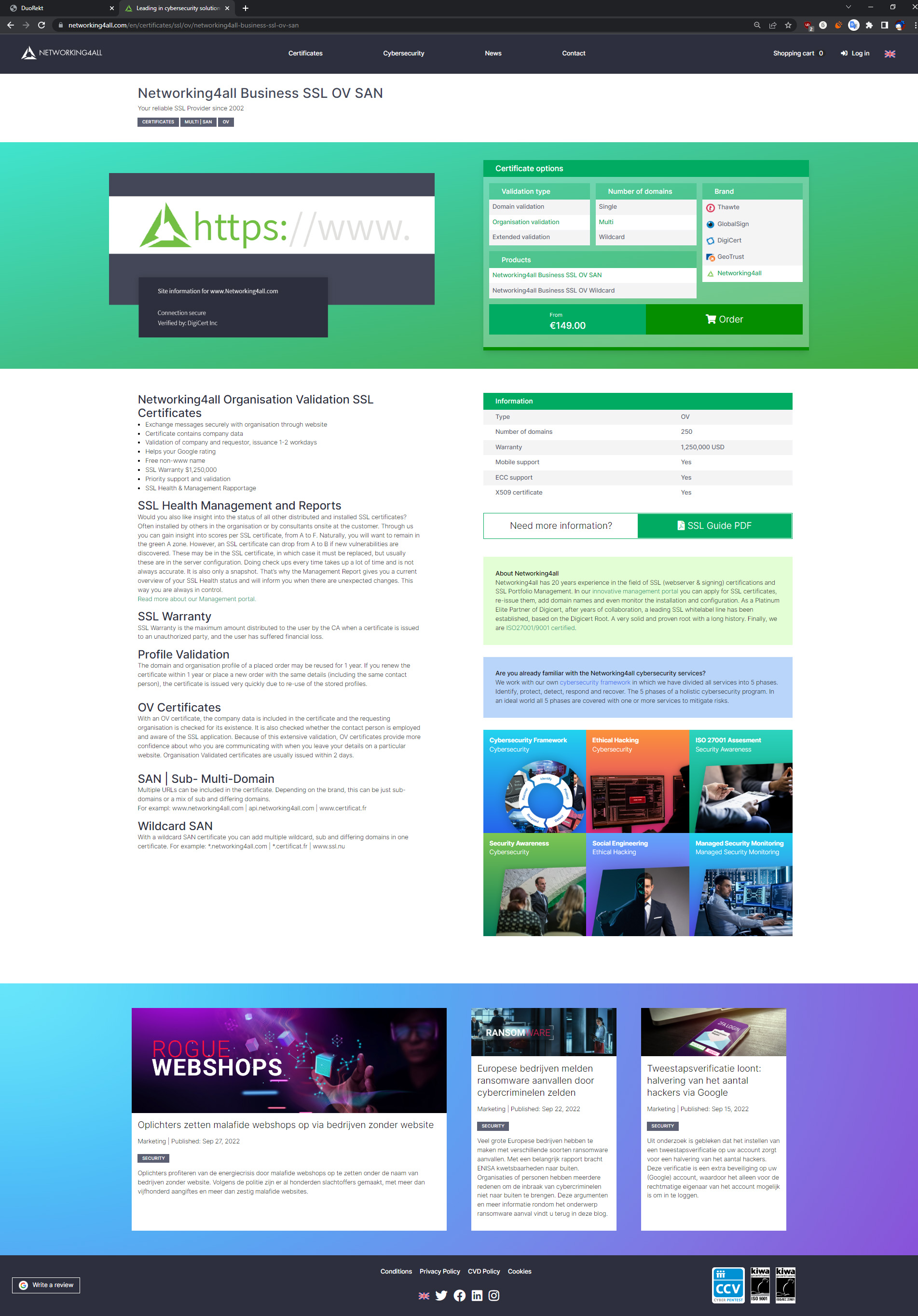
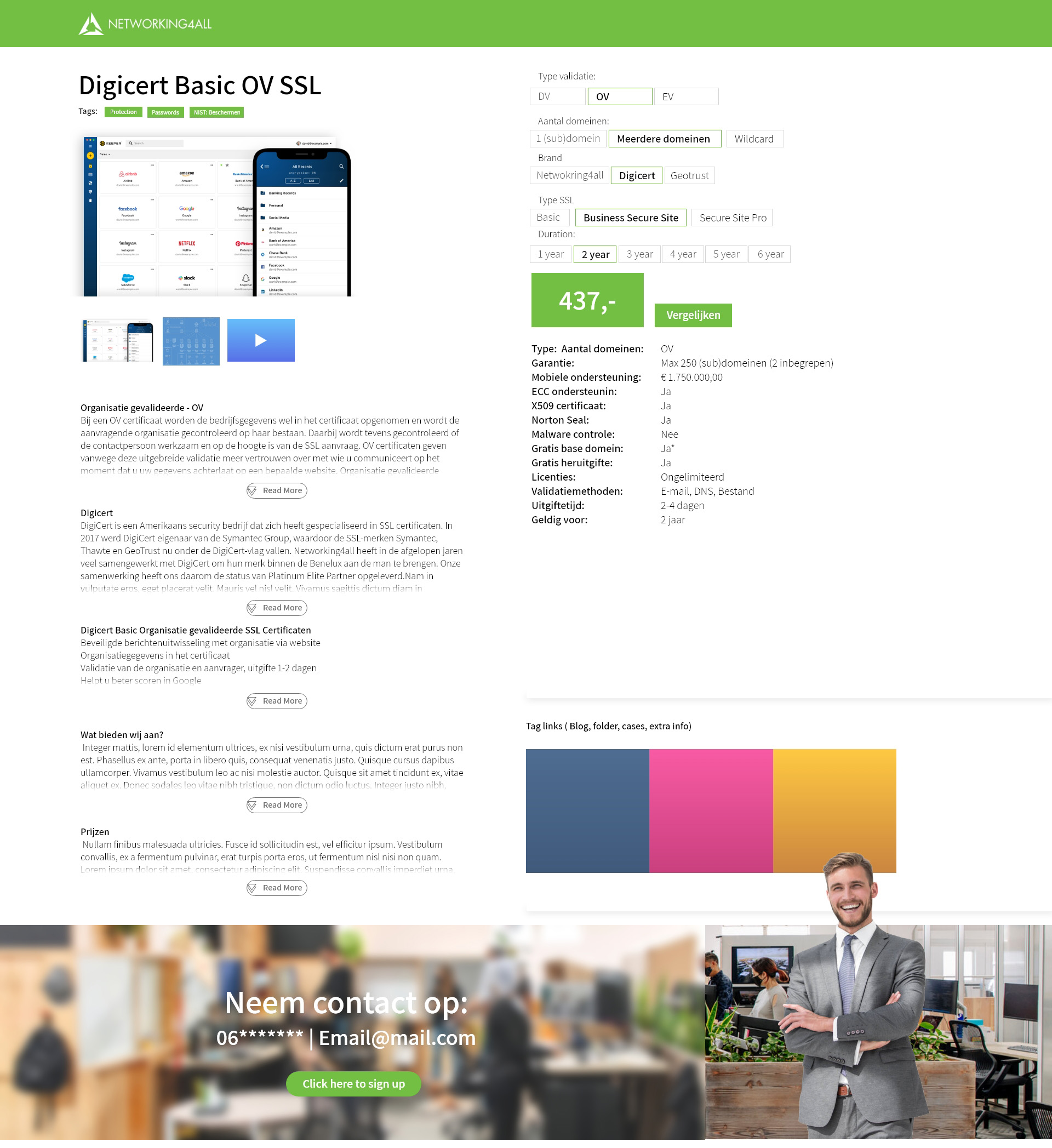
New Security Page
As you can see here the page now opens up with an image or a gallery. You can quickly see the price or download a pdf for more information and the page itself answers the most common questions like “What is a Pentest'' or “How does Pentest work?”
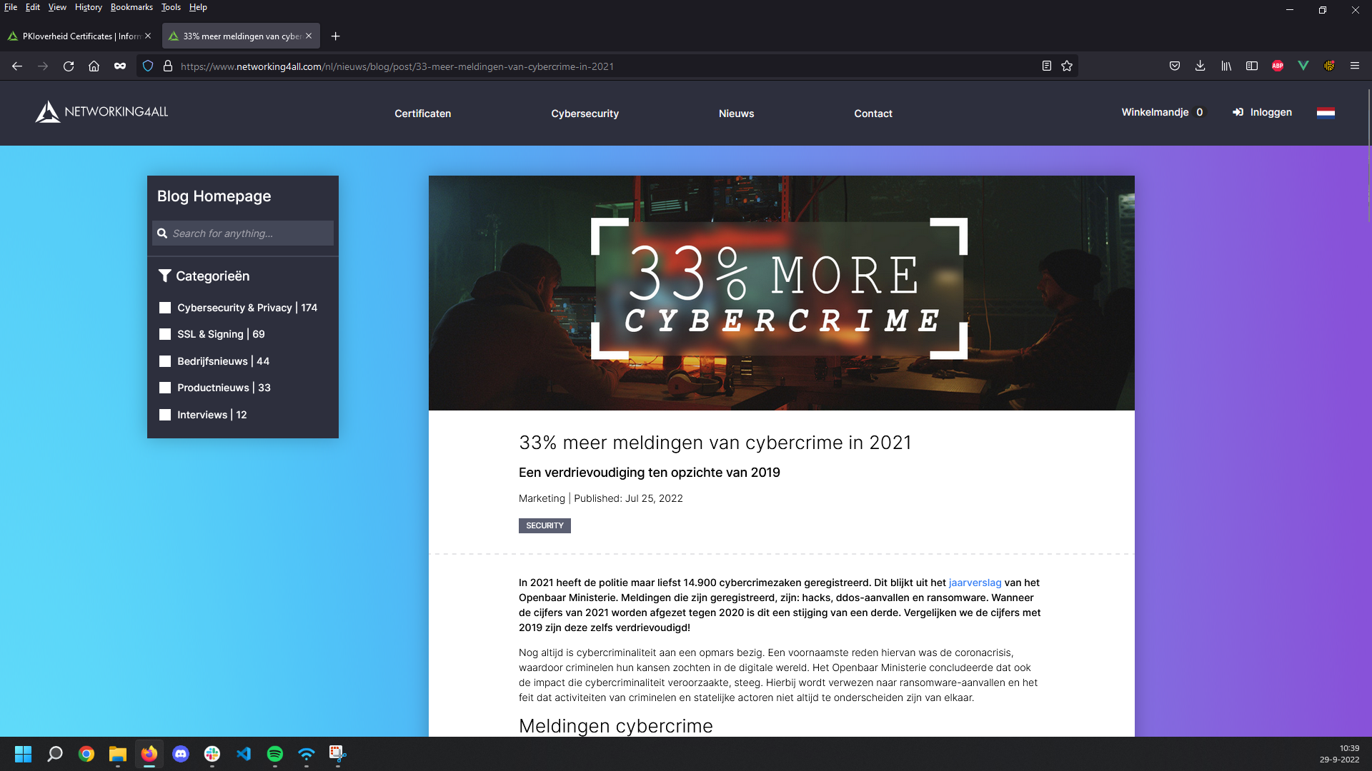
Old Blog
Old Home page
The old blog was just a template from Wordpress that seemed to be poorly maintained. The site itself had way too many different subjects and some didn’t even have functional pages because their redirects and links were broken. Since we were redesigning the website I also suggested that we move the blog from wordpress to our own system so we can have more control on the design and workflow.
Old Posts
The only problem with the old posts was that most were outdated and did not have good ways to find or keep up to date with them.
New Blog
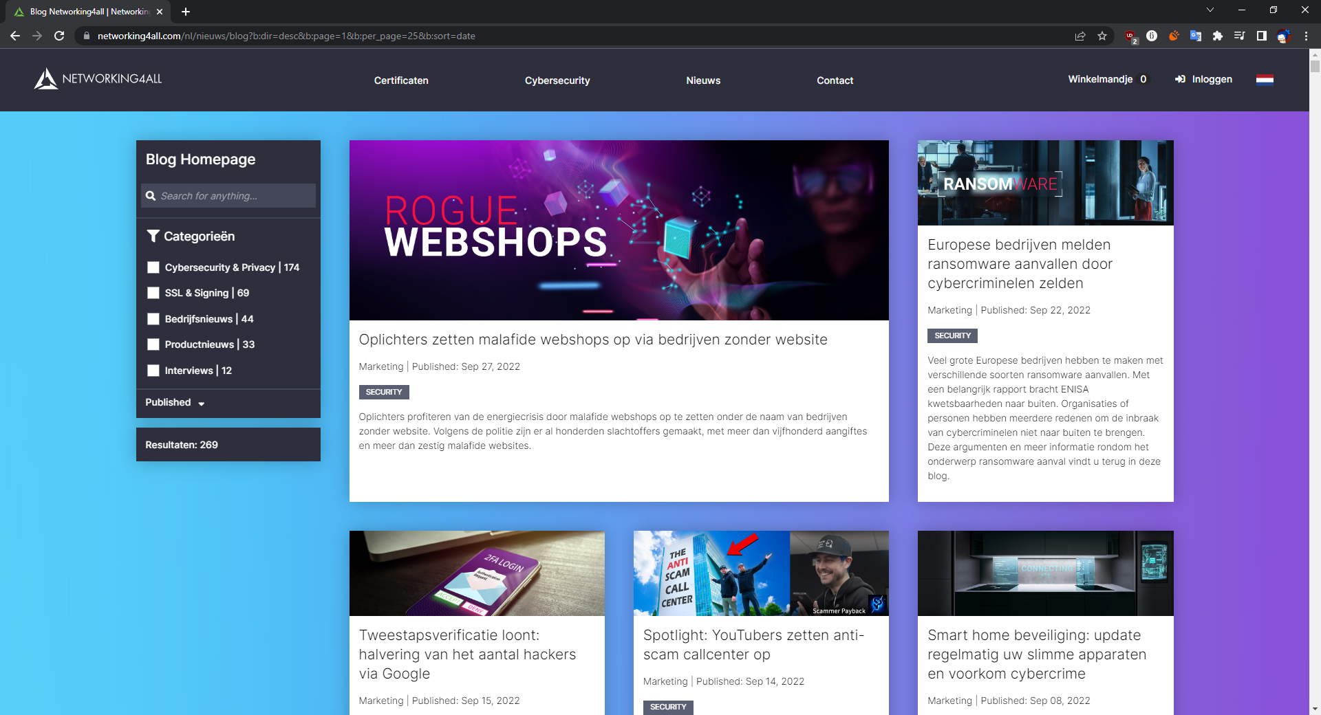
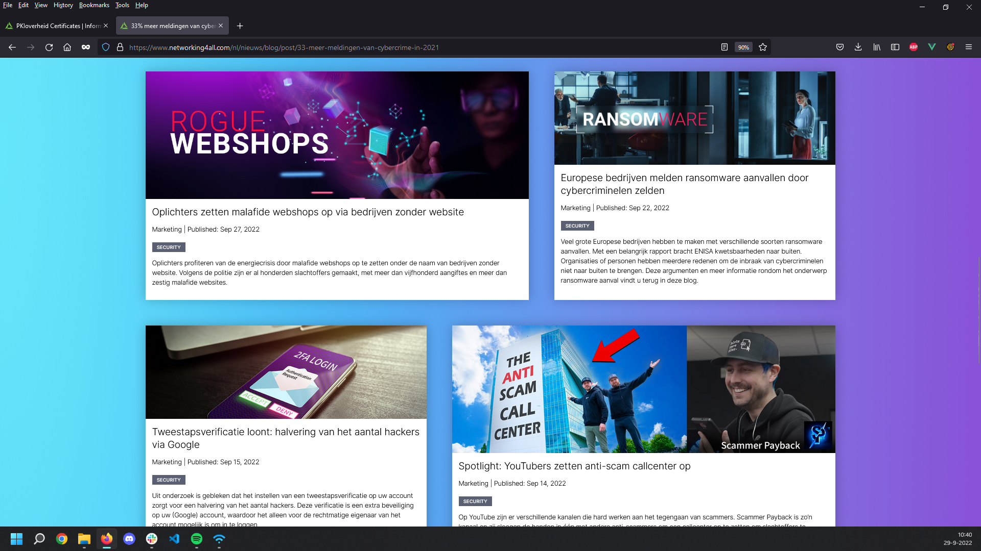
New Home page
The 10 categories are now combined into 5 by merging all security related posts together. With this new search function you can select a category and use search terms at the same time, also the new posts are now actively shared on LinkedIn and with the newsletters.
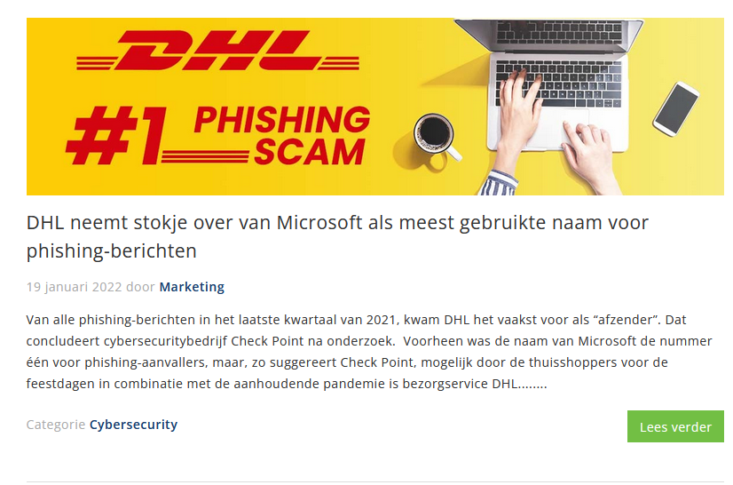
New Posts
The posts themselves are streamlined so you only have to select a date, upload an image and paste the text into a rich text box. Thanks to shutterstock and photoshop the images are a lot more interesting now.
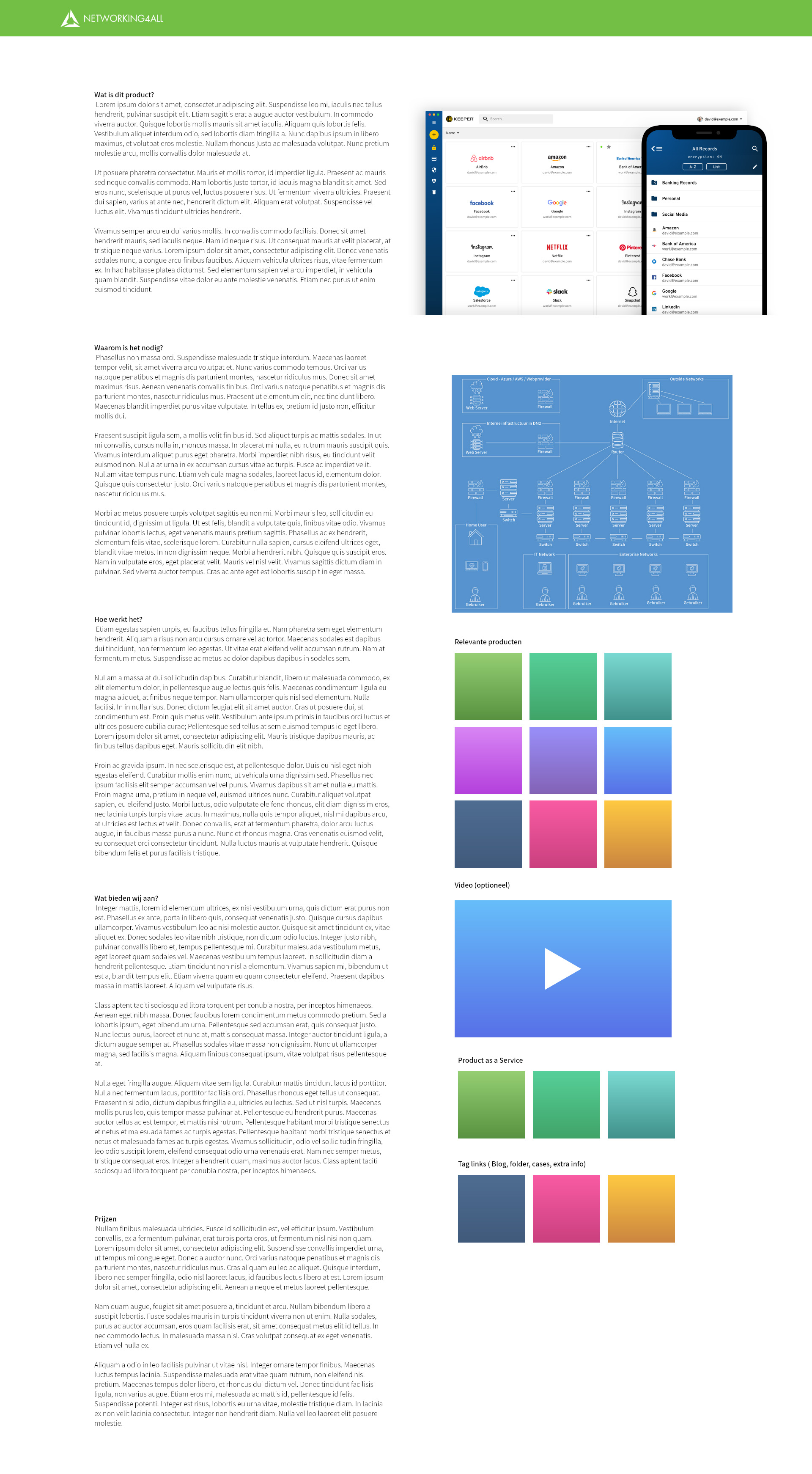
Old Network Map
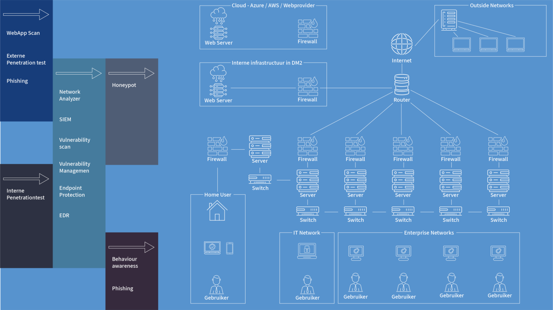
With this design you would look for your product name on the left and see what parts of your network it would protect. My problem with it was that it was too crowded, there were just too many icons and some (like the server icon) were used multiple times.
New Network Map
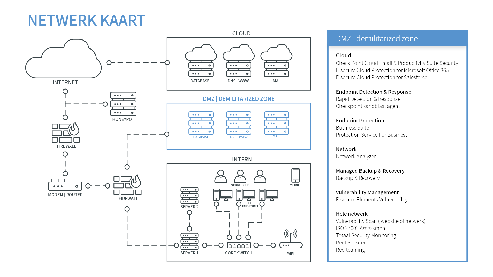
With the new design you can click on any part of the network and then on the right side it’ll show you what products will protect your system. This map will also show you when you’re on a product page which systems it will protect.
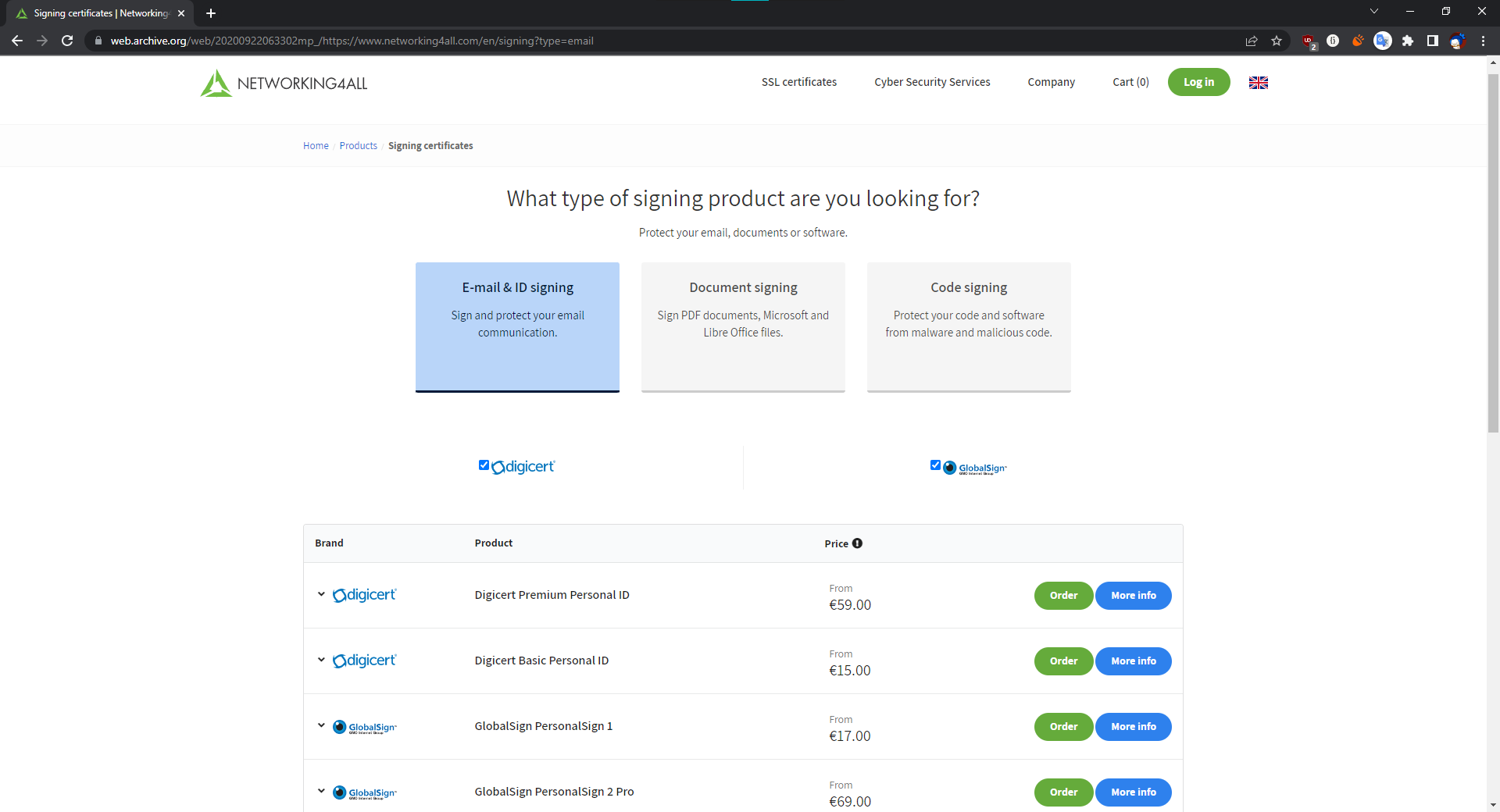
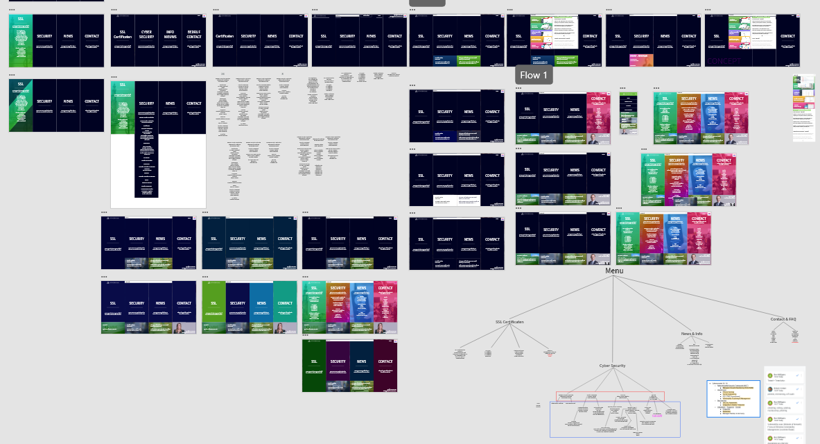
SSL Menu Variations
SSL info tab in the menu
After a lot of testing I still wanted to make the info tab visible while using the quick menu. This would make it easier to compare all the different products.
SSL info tab to the left of the menu
In one of the different variations it was on the side but I didn't like how it looked. It was mostly unused space with the table placed in the middle.
SSL Menu Final
SSL info tab underneath the menu
We scaled down the page so the info tab is now visible from underneath the menu. This makes navigating and looking for the right products a lot faster.
Concept Boards
First board
With the first board I wanted to try different styles and concepts to see what would be the best for our demographic. The potential customers who would buy it are senior security and network managers. So with that in mind I went to work and collected a Text input layout first.
Second board
After a base layout was chosen I started to test different ways to make the menu work. Before the products were just directly in the menu and it was getting crowded, so these designs are to see what could fit in the home page by adding subcategories.
Third board
Here I started testing colors for the menu and product page navigation, in the end we chose to use colorful gradients. The security related product pages will all be in orange and all certificate pages will be green. This way all other designs like presentation, pamphlets and social posts can use the same color pallets.
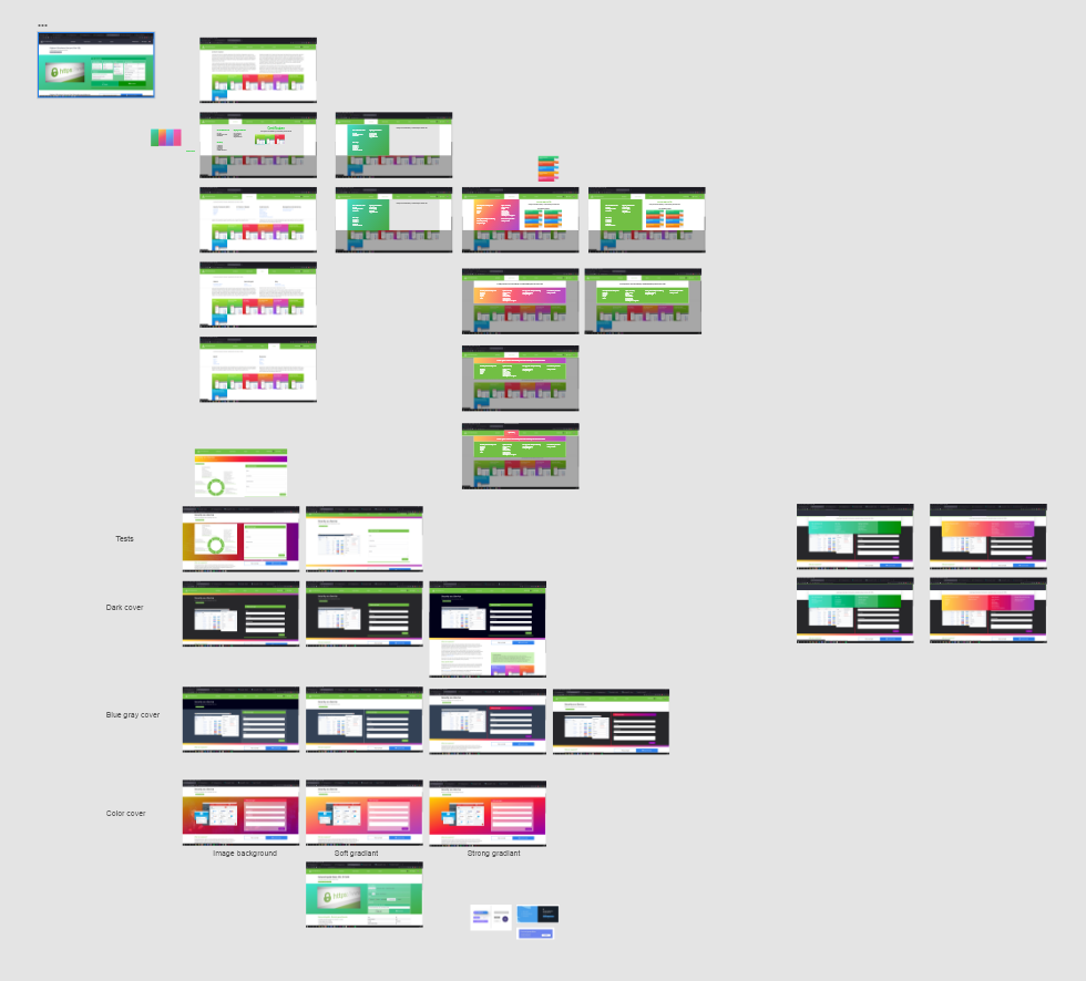
Fourth board
And finally we added some more color and font size variations for the home page.
First drafts
Text layout and input
This layout would be the rough texts, images, videos, redirects and call to action size inputs for a page. With this you can move around items quickly to see what could be more efficient.
Certificate product page
I wanted to experiment with different ways to navigate within our ssl/certificate products. We have more than 50 different products divided by validation type, number of domains and brands.
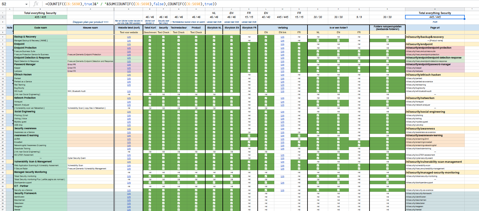
Planning and checklists
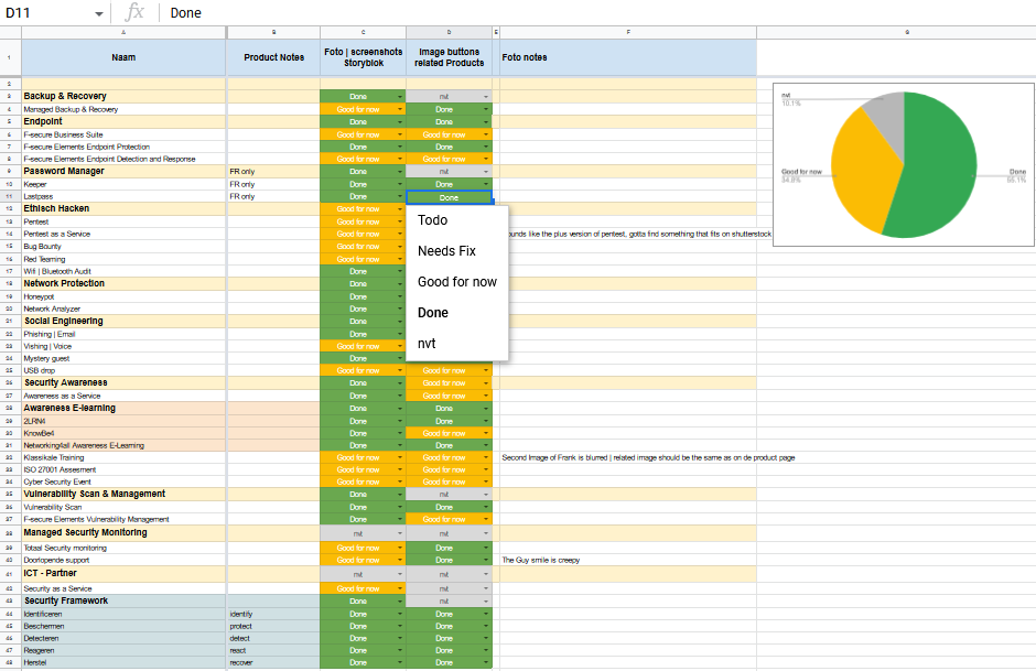
I set up a document with checkmarks, links, tasks and all steps needed per page to keep track of what was being worked on and what was done. With counters at the top so you don't have to scroll to see if a row is done. With this overview I could give clear updates to management and also coordinate with other departments about the text.
Images checklist
A lot of the images on the old website were already updated by me but weren't in the right size or format. Here I noted “Todo”, “Needs Fix”, “Good for now”, “Done” and “Nvt”. This helped a lot because it was now easier to prioritize.